Inspiration behind the #EndFGMCAsia logo & website
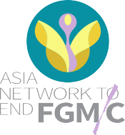
We spoke to the creative team behind the Asia Network’s branding to get a glimpse behind the scenes! Read on to learn about the design process of the Asia Network’s logo and website.
Nicolette Mallari is a freelance graphic designer and creative consultant from the Philippines. Getting to work on projects with a higher purpose and collective scope provides her the opportunity to contribute to social transformation – this has been her approach to publication and information design for clients like ARROW. Nicolette designed the logo of the Asia Network, working in consultation with ARROW and Orchid Project.

Why did you decide to take on this project?
I am more than happy to take on projects that have an impact on human rights, and women and girls’ SRHR.
Of all the graphic design disciplines, visual identity is the yardstick of a designer’s skill set. Much more than a merging of shapes, colors, and fonts to create an aesthetic, logos need to be able to express a visual narrative in the simplest and clearest of terms. The project for the Network started off with a design brief from the client, who outlined the purpose and objectives of the organisation. Design briefs are critical for designers, these provide focus and direction for the concept and outputs. Given the nature of the project, the Network also provided a shortlist of visuals to avoid.
What was the inspiration behind the logo design? What do the different elements symbolise and how did you choose the colour palette? Could you share a little more about the ideation/design process?
THE CONCEPT
Before the mouse hits the pad, the pencil hits the paper. This meant research – symbols, shapes, typefaces, colour themes – anything that would consolidate the message, values, and visions of the organisation into a graphic element was noted and sketched out. One of those concepts was a flower, long used as a symbol of femininity, fertility, and health.
REFINING THE CONCEPT
The next challenge was to render the flower with clean, flowing lines and give it a recognisable figure. The final logo render is charismatic yet visually effective: a flower in full bloom – with petals resembling wings, and its stigma and ovule shaped to gently resemble female genitalia.
DEFINING THE COLOR PALETTE
The colours in the palette were carefully chosen to reflect the identity of the organisation. Specific color tones were requested in the creative brief. Teal green for its positive connotations in Islam; purple, as a nod to ARROW and the Orchid Project, and to the wider feminist movement, many of which have purple in their logos; and yellow, for its sheer vibrance, is a symbol of hope and enlightenment.
Your hopes for the Asia Network to End FGM/C.
Like a flower in full bloom, may the Asia Network be the hope and renewal for women and girls.
The Silver Kick Company (TSKC) is a Bahrain-based creative agency with a big heart. The bright, young team have a burning passion to make the world a better place through the work they do, helping compassionate brands make an impact. We spoke to Maria Shaheen, the Digital Marketing Manager at TSKC. She handles everything digital: social media marketing, emails and newsletters, and website design and development.

Why did TSKC decide to take on this project?
The founder & CEO of the company, Shabana Feroze, is a survivor of FGM/C. So for her, anti-FGM/C projects are very close to her heart. As a company that believes strongly in being compassionate, we want to do whatever we can to help bring positive change to the world. Which is why we support non-profits in creating marketing material for their campaigns, workshops, events, and digital media. Whether it's pro-bono work or working on grants, we want to do whatever we can to help strengthen their voice!
What was the inspiration behind the layout and design of the website? What do the different elements/illustrations symbolise?
We mostly took inspiration from the amazing logo. (We shared the logo with our entire team because it’s so beautifully done. Kudos to the logo designer!).
Our design brief was super clear from ARROW and Orchid Project, which always helps! So we wanted to make an attractive, user-friendly website with vibrant colours to stand out from others in this field. Especially since this issue is a serious one, we don’t want to put people off from going through the website because it might be depressing or alarming to read information about FGM/C. With the Asia Network’s guidance, we chose illustrations that portray women from different ethnicities to make sure we include all communities that practice FGM/C. We used illustrations that create an impact and depict strong and empowered women.
All in all, the website depicts hope. That even though FGM/C is so prevalent, coalitions like the Asia Network won’t stop working to end it.
Your hopes for the Asia Network to End FGM/C.
We hope that by becoming more structured and raising more voices with other non-profits, the Asia Network can help stamp out FGM/C in our lifetime. No more women and girls should be subjected to this gender-based violence.
We hope to see harmful social norms and traditions changing because of the work the incredible members of the Asia Network do. And we hope we can help them in their journey.
by ARROW
